XPortHub3

I have used STM32F405RG for a long time, but decided to switch to STM32G series and upgrade some of my PLC modules. This shows STM32G491RE simply because I managed to buy a series of these. These are more capable than the F4 with upgraded IO + 2 FD CAN ports. I have earlier used SPI for communicating with Raspberry PI, but will from now on use CAN FD as IPC supported by an UART for RPI communication. With 5Mbps on CAN FD and 2-3 ports I believe that is sufficient for all signals except voice/video that we can special process.

This module XPortHub3 is mostly identical to XPortHub2. The main difference is the STM32G491RE that cost a bit less than the STM32F405RG.

CAN-FD uses up to 64 byte payload @ 5Mbps, but still support arbitration, so it is perfect as IPC for a stack of boards with short cables between.

  • 1 x 10/100 Mbit Ethernet
  • 1 x USB
  • 2 x CAN HS/CAN-FD
  • 6 x Serial

I have extra pins for 10 analogue and 5 PWM, but I doubht I will have connector space for the pins – lets see.

BSA – WPF Performance Issue part 3

This is the Diagnostics Tools in Visual Studio showing BSA Start-Up. The first big raise of memory usage is probably my Tool View – not sure – but the last one is me moving BSA to the other screen and redrawing the grid in the process. This is the cost – something like 50Mb or so – to recreate the grid because I changed the size. It is a bug here that it never realease the memory, but the real error is is just bad programming or basically me not realizing the cost of using UIElements in arrays.

The irony is that I did the very same mistake some 30 years ago on my very first Windows applications – I nedded a grid and created a grid based on multiple edit controls. The system crashed because I ran out of resources – this version do not crash, but it telling me very clearly that this is not the path forward. UIElement needs to much memory for it to be duplicated the way I do.

I have fixed some other issues that affected performance and they helped, but this I will need to fix by dramatically reduce the number of UIElements I use – I think.

The solution is to create proper controls where both the TreeView (Tool list), Grid and Property Editor is a fixed number of UIElements – not big arrays of them. Beginning with the Property Editor this is easy technically – but a bit of work – I need to create one control that display my tree and then use UIElements to place inline as I want to edit objects. Badically I need to create a proper TreeViewGrid or find one I can use. Taken into account some of the tricks I use to create a functional property editor I expect I will need to create this myself. This is after all a very important part of BSA as details here decides how easee the result will be to use.

Conclusion : Arrays of UIElements use a lot of memory and should be limited.

The upside: I did need a TreeViewGrid anyway!

The downside is that controls also consist of UIElements, so I am not sure I actually have a smart solution here yet…

BSA – WPF Performance Issue part 2

Following my previous article I realized that creating and adding UIelements are the issue. I have those in 2 places – once as I create/modify the grid and secondly as I create a list of UIelements for the Property Editor.

In both cases I create a load of controls using new and maximize IO between CPU and GPU.

The grid is not a problem – the issue is more than once I have a lot of canvas w/grids and resize the grid I recreate it. This should be easily solved by creating a seperate grid component that is updated. The grid is after all just a visual background gimmick.

The property editor is more difficult. It is quite advanced and as is depend of WPF. It is 2 problems here (1) the memory usage. It seems to me that garbage collector is garbage not releasing memory. If I click between two objects it just grab more and more memory and never give anything back by the looks of it. I can solve this the same way as the grid, but this will cost me. This is very annoying because this type of component in Forms would be fast and easy – so the question is I could do this as a forms component and use it in WPF? I also reaize this also goes for my treeview with tools – it does grab a lot of memory – bla this is a bit of a setback…

to be continued.

BSA – WPF Performance Issue part 1

Loading the attribute list into the property editor was a performance surprice – it is slow and noticeable at already ca 10 attributes. I am fully aware that IO between CPU and GPU is a weak point in performance using GPU technology, but this one is rediculous. I started having similar problems on QML with ca 1000 entries in a table. QML is a little faster than WPF due to the difference between C++/V8 and C#, but not that much faster – so something is wrong in my coding here. I will figure it out.

Debugging these things is a bitch, but what I usually do is to start adding counters to see how many times functions are called – and if you get an insane number of calls on a function you usually have the answer. You can also use profilers, but I must admit I have never been good with those.

WPF/QML/Avalonia is capable of Oscilloscope plots that require an insane IO, so this is not a real limit – it is just a trick or bug I don’t understand yet. This is the first time I have a performance issue at all with WPF, so it will be interesting to find out where the bug is.

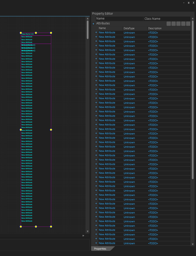
The screenshot above is Visual Studio profiler and the red circle show the problem. This is the first time I use this. You see that GPU performance is low and BSA feels very alive once the editor is set. But notice the increase in memory usage – this was some 20 attributes on a single class creating an insane memory usage. And huge amounts of memory allocations will create CPU usage that can explain what I see. For 20 or so attributes we talk around 200 Mb indicating that each attribute require 10Mb – no way – I am doing something very funny here.

A quick analyze shows that it is my property editor that is the problem – it allocates an insane amount of memory for each row … hmmm. What I have done is a simple tree of stacked objects – stupid, fast coding – it works well from a functional view, but obviously not from a performance perspective – yet.

Further analyze shows that yes I do call functions that clear and recreate UIControl children and the Clear() function never release the previous memory. This is not my property editor as such it is my usage of “UserControl” in general … hmm interesting … stay tuned I will find a solution to this.


… to be continued …

BSA – Attribute List Expanded

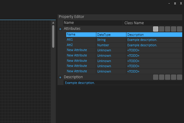
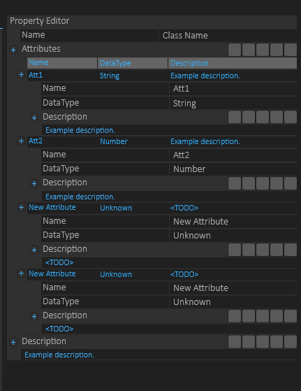
The table above looks ok – you can see an array of attributes as expected. The picture below is the same list with attribute details expanded.  It’s a bit work in progress, and I am not sure about the result yet – I have to think about this one as it looks a bit messy. That said it does the job.

BSA – Attribute List

This is my first attempt on a mock up of an array of attributes for UML Class, and I am very pleased with the result. I need to change the header color of the table and do a few things, but this was a first mock-up to get a feeling about how functional this would be – and it works out surprisingly well. The detail edit will be a sub-list of attributes, but I can also support in-line edit etc.

The code for this grid was hand-tailored because I needed a grid that could expand into property list (still TODO) – my C# coding is still on the learning side for WPF, but I am very pleased with the results I achieve. No regrets on moving away from Qt/QML on GUI!

The blue header color is a bit to much, so I will swap it for a grey one – if you look at it you will notice that it takes the attention away from the actual data – it looks like the header line is seleceted.

Another observation is that this will work for tables with 2-3 (maybe 4) columns – not more. The attributes will have far more fields that can be edited, but the overview list shown here simply have no room for more. In this overview I can also show around 200 characters of the description etc, while the full description will be a text block the same way as for the class itself then expanded. It will be hours on details here and I need to look into how to make this a re-usable component – tables and trees are very usable components in any application.

BSA – First Application

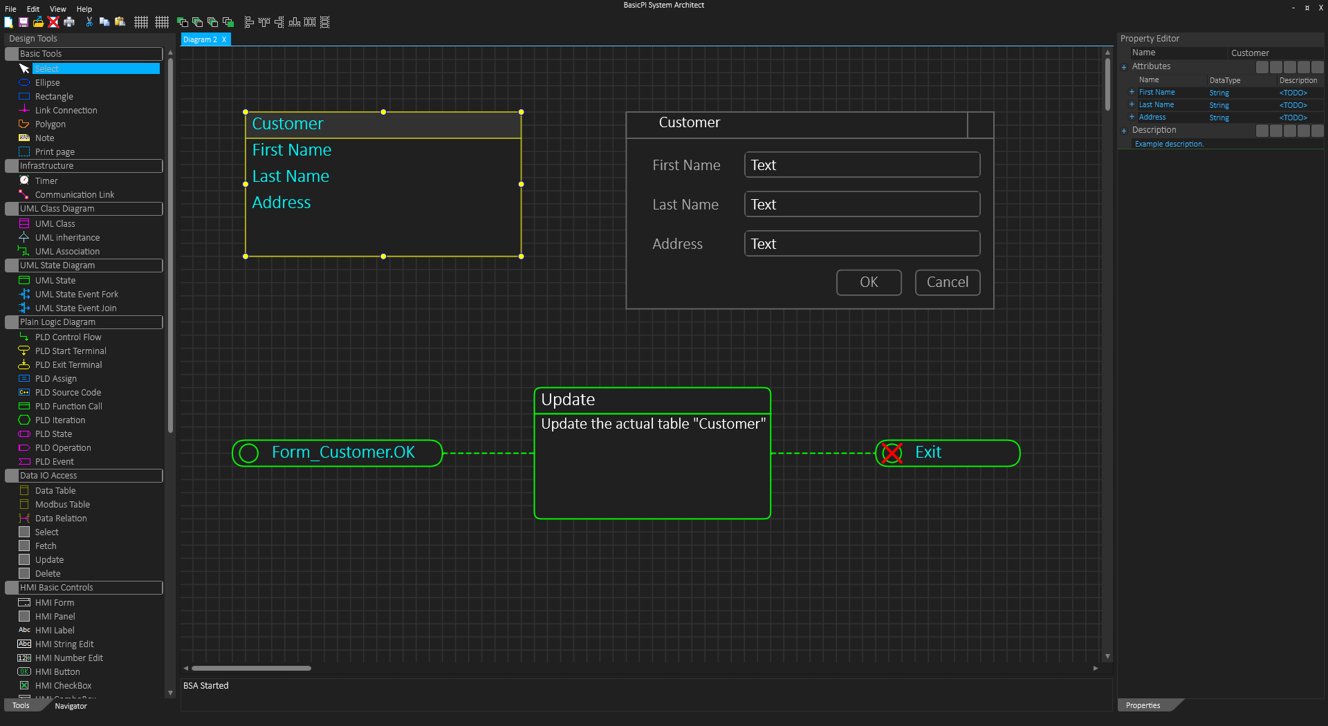
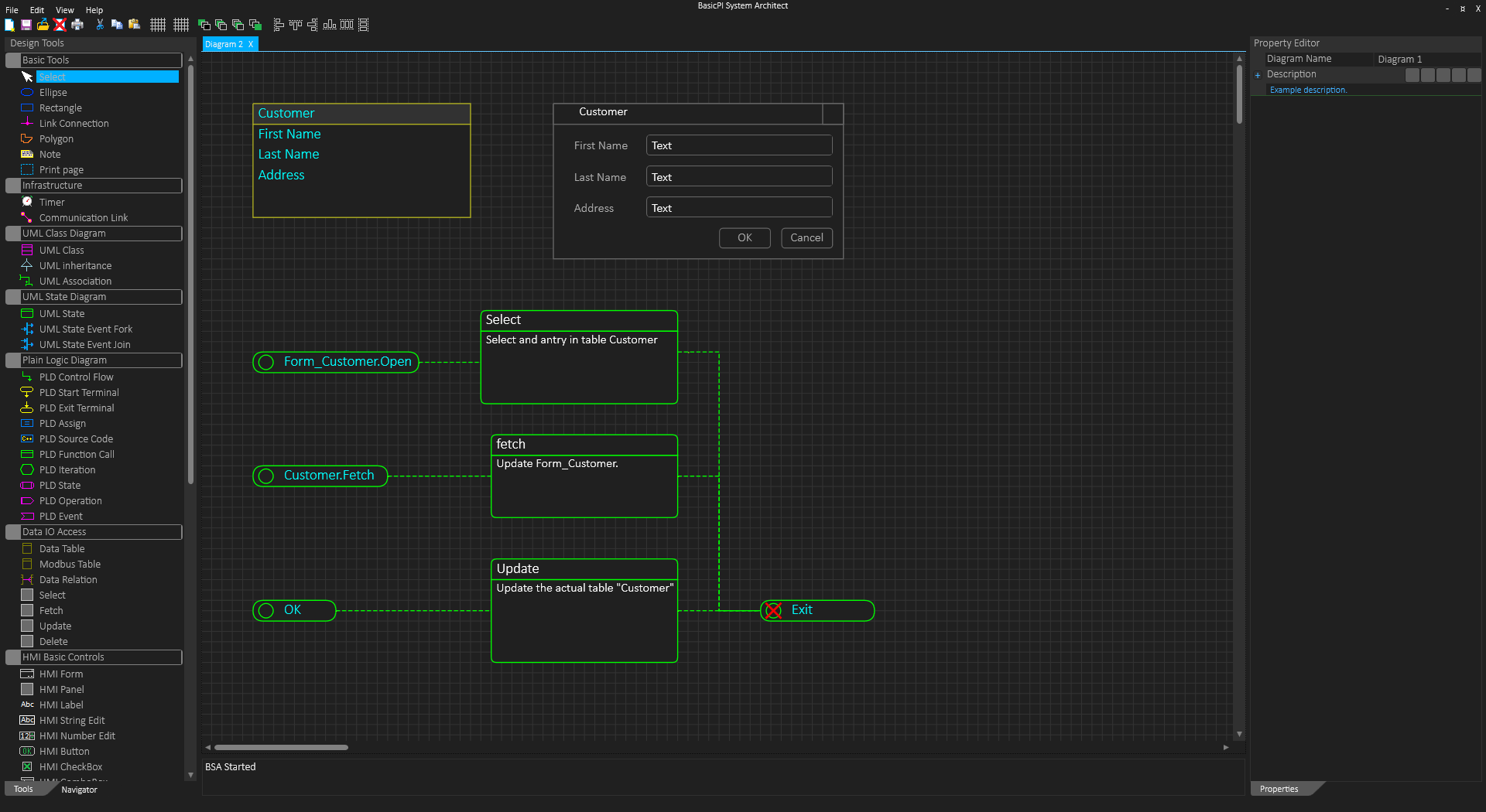
I will introduce a display symbol to do IO towards HMI so I don’t need copies of Forms everythere, but the diagram below is actually functional.

I could actually generate code based on this – the two processes are modules where one run on STM32 and the second on Raspberry PI. The first collect ADC samples, the second display the results on a form. High level diagrans will be more or less like this and can be used as specifications in front of customers. If you double click on “ADC Sample Process” you will either see actual source code, PScript, Python, C++ or a sub-diagram reprecenting the logic. It will be a few executable details, but doing this exact job will be about this easy.

Notice that unlike LabView or other similar tools we process events in proper diagrams where the user can mix code as he/she pleases. The actual modules can be whatever you need them to be.

I recently had the opportunity to work on competing solutions and the experience tells me that I am on the right track – I have made a lot of correct choises that you will feel the power of as you start working with BSA – and while competetive products cost ca 4000 USD per license this will be closer to 40.- USD in cost for commercial usage (free for open source) – and no dependency – if all you want to do is to use BSA to generate source code that you maintain manually – be my guest.

Stay tuned…

BSA – Grid Alignement

The purpose of a design grid is to force symbols to align to a grid line at left, top, right and bottom so they are easy to position and size compared to eachother. This speeds up drawing/design as you use less time sizing and positioning symbols on the screen. The default design grid is 10 points which is fine for diagrams, but not for HMI.

The picture above show the issue with a grid of 10 pts – the space between fields become very large – for some apps this will be ok, but for many apps we want less space. I have two solutions to this (1) is to adjust the field margins on top/bottom – in the above example I have adjusted the top to demonstrate – If I do top and bottom on every component – basically add a standard Margin I can put them edge to edge and they will still look like separate fields. This is one of the usages for the property Margins that specify offset left, top, right and bottom. (2) I can switch to a smaller grid of 5 points. The easy way of doing this is by having two separate grid buttons in the menu – one for 5 and 10. Actual grid size can be set by user, but 5 for HMI and 10 for diagrams are good values. The same goes for default Margins (that can be overrided).

The same screen layout with 5 pixel grid can be seen below – we use far less space:

Using less space can also be done with margins. Doing diagram alignment on 5 pixels is however a bit more fiddly than with 10 pixels which is why I want both of them.

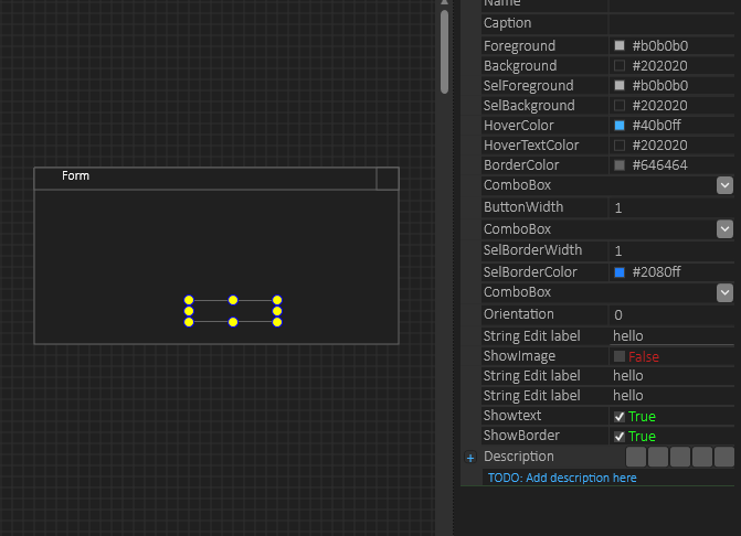
This last one uses Margins, but I do now get an issue with the height of my edit box compared to font I use. This was with 2 pixel margins top and bottom. The next picture is the same with 1 pixel margins just for demonstration. But, even this will cut some characters at bottom so with a fontsize of 12 I believe 20 pixel height is optional. If you really want to use margins like this you need to downsize font as well.

The good thing about these details is that an user should never be forced to think about them at all – it will be cases where you sit an fiddle with visual details, but the objective is to have an automated path that is straight forward and sufficient for 99% usage cases – simply yet another issue I don’t want to spend time on once BSA is up running. You can set grid sizes, turn off grid or set default margins to have your own automated path.

C# assign behavior

     double h = Height = newSize.Height;

Height is a property with set and get functions in C#, so what I expected was that set Height was called first – which it does and then that get Height was called secondly – which it does not.

In fact the assign operation will execute the following:

    double h;

    Height = newSize.Height;

    h = newSize.Height;

What I need is this;

   double h;

   Height = newSize.Height;

   h = Height;

The difference is that I coded height limitations into the set function and was not aware that this cascade statement skipped get.