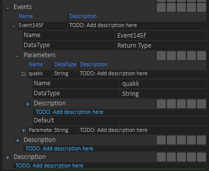
I am in general very happy with the property editor, but it does have room for improvements. In this case I edit a table within a table. First the list of events and on each Event a list of Parameters. It works fine, but the editor get very messy to look at. I have a bug with two different fon-sizes as well, but the main issue is clarity as to what you edit. This is a very small example. One possibility is to collapse entries – which I already do as I add new ones, another possibility is to mark the table header (Events and Parameters) better. For now I will fix the font size and leave it because it is not critical. But, it will need some attention at some point. The challenge is coming up with good ideas that actually improve things.
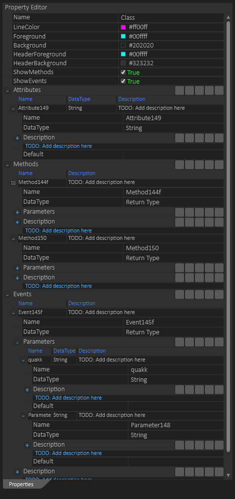
And for the record – the property editor and integrated tables are very fast to work with. This is a sniplet of a class and it got 3 tables of which 2 have sub-tables. It might be that a simple tree-line on the left row will help on overview? The full example is shown below with Attributes, Methods, Events etc to illustrate how messy it can get. That said – the editor is fast and easy to work with and if you avoid expanding everything it also looks cleaner.
Using the editor is simple – you click on an objekt in the diagram and it’s properties are listed – as you edit the changes appear instantly. The only issue is that as I edit text I would like the text to be inline on the object (sometimes) – this later is more an issue of text beeing 100% the same – if line width is different in editor than on the object showing the text it can get confusing. Again – this is a small issue and the editor is fast to use – I think I have mentioned that a few times :). I am whining a bit over details, but this editor is a key component. It has to be good and fast which is why I am so picky. Lets see what we can bring up of ideas.

