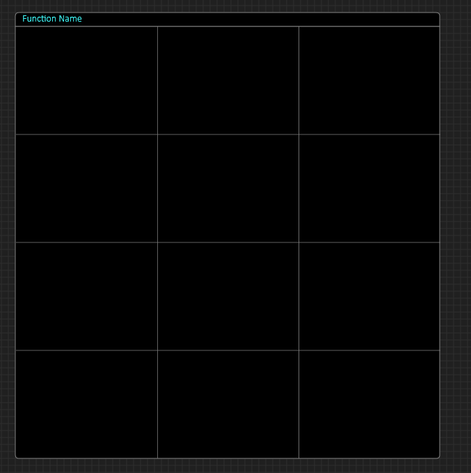
Some of you will remember my idea to use a grid to enter components one by one and then showing the result at top. Having tested that option a bit I decided against it. I found that just using the normal designer stacking the components on top of eachother was easier. At the end you just select

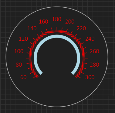
The Gauge below is actually not a gauge but composed of an Ellispe, a circular Label, a circular Tick and a Pie. It is very easy to assemble in the designer as is – afterwards you just select the components and group them as a new, visual component that you can re-use. This is just an example – the real power comes then combining this with other components to create custom power components – I will get to that later. But, conclusion – the grid designer will be removed – it serves no real purpose.
