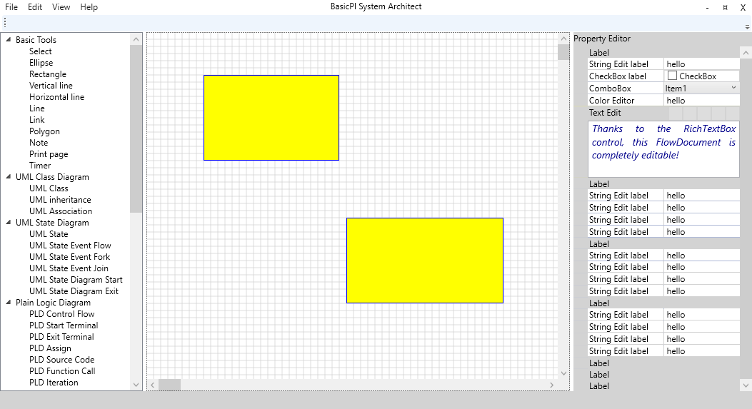
The WPF based version of BSA is getting there. It don’t look as cool as the QML version (yet). The reason I am avoiding Dark Theme is because I want to dig more into BSA functionality and avoid spending time on controls like the scrollbar’s for now. Usage with scrolling and zooming is in place, so I need to figure out the tab’s and multiple diagram bars next. Scrolling on this is not as cool as on QML (yet) – QML have a feature that it accellerate and deaccelerate so the scrolling feels more alive. Scrolling on WPF is by default the same old stepping – I probably have to add the animation from QML myself – no idea yet..
I would like a cooler looking scrollbar, but I use ScrollViewer 3 places and the scrollbar belong to this – I did not code a line to get scrolling correct. I fear I have to re-write a few controls to get back the cool QML scrollbar’s, but that’s nothing compared to all the QML controls I had to fight.
QML vs XAML is basically very much the same with different syntax. But, XAML is better integrated with C# and this is where productivity hits you hard. And to repeat myself – on WPF I can get a 3rd party library to deal with dark Theme.
Drawing performance ? I don’t know – looks pretty much the same so far. That said I did this app with good results in both Qt and C#/WinForms as well. WPF have many ways to do graphics so I am still reading up and testing to understand what is the best path. I can get away with any of them, but as I later will build more performance hungry controls I would like to understand their impact, pros and cons before I do to much of the graphics itself. It is also a 3rd party component “WritableBitmapEx” I want to try out. Fun for days to come.
Once I have my mind settled on graphics and how to draw optionally I will start on the drawing engine and draw more than just rectangles. But, this is pretty cool taking into account that this is ca 3 days work to get here so far. Keep in mind that what I am doing is one of the more complex graphics applications in terms of user interface. I struggled more than a bit with this on QML and it has so far been much easier on WPF – without dark theme that is.
The plan for the QML version was to focus on HMI first. The main reason was (and is) that HMI have become so over-complicated. You need to dig deep into technology like QML or WPF and many embedded developers simply do not have the time or skills needed to do this – neither should they need to. Making a HMI with a few gauges is hardly rocket science IMO.
