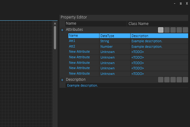
This is my first attempt on a mock up of an array of attributes for UML Class, and I am very pleased with the result. I need to change the header color of the table and do a few things, but this was a first mock-up to get a feeling about how functional this would be – and it works out surprisingly well. The detail edit will be a sub-list of attributes, but I can also support in-line edit etc.
The code for this grid was hand-tailored because I needed a grid that could expand into property list (still TODO) – my C# coding is still on the learning side for WPF, but I am very pleased with the results I achieve. No regrets on moving away from Qt/QML on GUI!
The blue header color is a bit to much, so I will swap it for a grey one – if you look at it you will notice that it takes the attention away from the actual data – it looks like the header line is seleceted.
Another observation is that this will work for tables with 2-3 (maybe 4) columns – not more. The attributes will have far more fields that can be edited, but the overview list shown here simply have no room for more. In this overview I can also show around 200 characters of the description etc, while the full description will be a text block the same way as for the class itself then expanded. It will be hours on details here and I need to look into how to make this a re-usable component – tables and trees are very usable components in any application.
