The purpose of a design grid is to force symbols to align to a grid line at left, top, right and bottom so they are easy to position and size compared to eachother. This speeds up drawing/design as you use less time sizing and positioning symbols on the screen. The default design grid is 10 points which is fine for diagrams, but not for HMI.
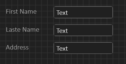
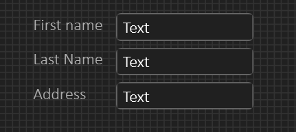
The picture above show the issue with a grid of 10 pts – the space between fields become very large – for some apps this will be ok, but for many apps we want less space. I have two solutions to this (1) is to adjust the field margins on top/bottom – in the above example I have adjusted the top to demonstrate – If I do top and bottom on every component – basically add a standard Margin I can put them edge to edge and they will still look like separate fields. This is one of the usages for the property Margins that specify offset left, top, right and bottom. (2) I can switch to a smaller grid of 5 points. The easy way of doing this is by having two separate grid buttons in the menu – one for 5 and 10. Actual grid size can be set by user, but 5 for HMI and 10 for diagrams are good values. The same goes for default Margins (that can be overrided).
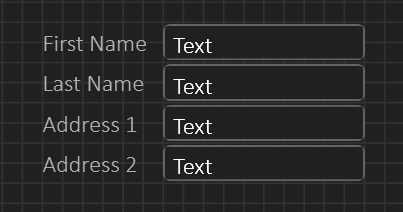
The same screen layout with 5 pixel grid can be seen below – we use far less space:
Using less space can also be done with margins. Doing diagram alignment on 5 pixels is however a bit more fiddly than with 10 pixels which is why I want both of them.
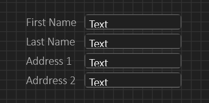
This last one uses Margins, but I do now get an issue with the height of my edit box compared to font I use. This was with 2 pixel margins top and bottom. The next picture is the same with 1 pixel margins just for demonstration. But, even this will cut some characters at bottom so with a fontsize of 12 I believe 20 pixel height is optional. If you really want to use margins like this you need to downsize font as well.
The good thing about these details is that an user should never be forced to think about them at all – it will be cases where you sit an fiddle with visual details, but the objective is to have an automated path that is straight forward and sufficient for 99% usage cases – simply yet another issue I don’t want to spend time on once BSA is up running. You can set grid sizes, turn off grid or set default margins to have your own automated path.


